2009年10月5日星期一

Elena Odriozola

Elena Odriozola is a published illustrator of children's books. Some of the published credits of Elena Odriozola include The Story Blanket, Vegetable Glue (Books for Life), Cuando sale la luna.

Below are a selection of her work:


I like the way she's been using collage-like pattern to make the woman's clothes, the braches on her head shows a feeling of fantasy.


Though the character is almost emotionless, the picture is still communicating a sensation of coldness and loneliness, I like this sort of simple but impactful style of drawing.


I really do admire her style of illustrations, the tone of voice is quite peaceful, silent, but meaningful at the same time,I like this kind of beauty.And it's a sort of style that I can develop myself into.

Meng-chia,Lai

Student prize-winner

Meng-Chia Lai is interested in pursuing a diverse illustrating career, including adult and children’s illustration, editorial and character design. During her studies, Meng-Chia made four children’s books, of which OH! is the third. She is currently in discussion with French publisher, Edition Lirabelle, over its publication and that of another book Peebi Lost . For inspiration, she draws with children at her parents’ kindergarten in Taiwan. Artists who have influenced her include Picasso, Matisse and the ancient Chinese calligrapher and painter Wang Hsi-chih.

Winning Illustration: OH!

Dummy book, laser printed from original artwork in Chinese ink on Chinese paper

Meng-Chia came up with the story for OH! after swallowing an orange pip while chatting to her mother. ‘She said to me that I don’t need to buy oranges in the future! I chose ink with a touch of orange to make the book with a simple but practical message for children, "Don’t talk with your mouth full".’ - Meng-Chia Lai

"Oh!" Published by Édition Lirabelle, France 2006

Ling likes oranges. She shares it with her classmate Mei. Ling swallowed an orange pip by accident..... This is a picture book with a message- "Don't talk with your mouth full".

This book was chosen one of the five V&A Illustration Awards Student Illustrator 2005, the original paintings exhibited at the V&A Museum London.

Web:Meng-chia Lai


Meng-chia Lai loves being inspired by everyday life. Especially people, music, nature, and food. Expressing from her mind on to her art works give her the opportunities to communicate with others. It is one of the best ability to have.

The core ingredients of her work are the warmth of humanity, and imagination and inspiration from everyday life. As she works, she enjoys being the casting director, set designer and director, creating a world from her observation and imagination to communicate to people.

Image-making is a language that is understood internationally and is a unique ability given to human beings. Her strength is her ability to use images to communicate to people all over the world, bringing an emotional atmosphere to people in order to move them.

2009年10月4日星期日

Neargo


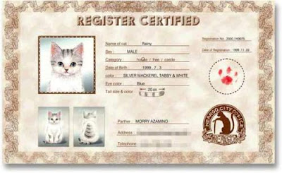
This is a picture book about the country of cats, the writer has visited a city named Neargo, which situated to the south of Milan, Italy. The city abuts Genoa, has a population of around 200 thousand, with rich surroundings and was encycled by the beautiful ocean. There are innumerrable tourists coming to visit neargo each year, besides for the beautiful scenery, they are visiting for the lovely cats living here.


All the cats living in Neargo have to register their ID.


The cat currency: euros are normally interchangable, but the main currency in Neargo is N, N=22.2 yen. There are cats patterns on the bills, they arefollowed by the tourists because of rare and lovely.


Brian Biggs


He has written and drawn comics and graphic novels, designed magazines, and illustrated for many many magazines and newspapers. In 2003 he began illustrating children's books with Shredderman. Since then he has illustrated several more books and he's currently working on even more. He continue working on editorial projects, as well as a lot of advertising, posters, and on a lot of toys and puzzles. He also work with animation, music, and various other media.

Web: Brian Biggs

Marc Boutavant


Marc Boutavant is a French graphic designer, illustrator, and author. His illustrations have been widely published in magazines, books, and album covers globally including the New York Times, Martha Stewart Kids, and the New Yorker. He was recently featured as one of world’s leading children’s illustrators in the book Play Pen: New Children’s Book Illustration.

Web: Marc Boutavant

2009年10月3日星期六

Memoirs of a Geisha


Memoirs of a Geisha is a 2005 film adaptation of the novel of the same name, produced by Steven Spielberg's Amblin Entertainment and Spyglass Entertainment and by Douglas Wick's Red Wagon Productions. It was directed by Rob Marshall. It was released in the United States on December 9, 2005 by Columbia Pictures and DreamWorks. It stars Zhang Ziyi, Ken Watanabe, Gong Li, Michelle Yeoh, Youki Kudoh, and Suzuka Ohgo. Ohgo plays the younger Sayuri in the movie, which was filmed in southern and northern California and in several locations in Kyoto, including the Kiyomizu temple and the Fushimi Inari shrine.

The film was nominated and won numerous awards, including nominations for six Academy Awards, and eventually won three: Best Cinematography, Best Art Direction and Best Costume Design.

Memoirs of a Geisha revolves around a young girl, named Chiyo, who is sold into the life of a geisha and her struggle as a geisha to find love.

The Japanese release of the film was titled "Sayuri", based on the main character who was renamed as Sayuri in the movie.

Telling Tales

This exhibition explores the recent trend among European designers for unique or limited edition pieces that push the boundaries between art and design. It showcases furniture, lighting and ceramics, designed by a new generation of international designers, including Tord Boontje, Maarten Baas, Jurgen Bey and Studio Job, who are all inspired by the spirit of story-telling. Each tells a tale through their use of decorative devices, historical allusions or choice of materials, sharing common themes such as fantasy, parody and a concern with mortality.

The exhibition is in three sections:

The Forest Glade is inspired by fantasy and nature evoking the spirit of fairytales.


'Princess' chair
Tord Boontje

Antique chair, silk, embroidery

The morality of fairy tales relies on oppositions of good and evil, often taking a visual form. This chair and the 'Witch' chair, also by Tord Boontje, show both traits. The 'Witch' chair is scaly, dark and sinister, while this chair is like a child's fantasy of Cinderella at the ball: effervescent, elegant, light and fanciful.


'Fig Leaf' wardrobe
Tord Boontje

Hand-painted enamelled copper leaves, lost-wax-cast patinated bronze tree, iron tracery support structure, hand-dyed and woven silk base and back

Tord Boontje regards the fig as a symbol of fertility, associating it with oases and the biblical notion of Paradise. The snake persuaded Adam and Eve to eat an apple from the tree of knowledge. They then fell from grace and were expelled from Paradise, wearing only fig leaves to hide their newfound shame. Ironically, the wardrobe only becomes 'dressed' when its user is not.

The Enchanted Castle exaggerates and parodies historical design styles often associated with displays of status.

Heaven and Hell is concerned with themes of mortality and the afterlife.

Faber and Faber: Eighty Years of Book Cover Design, 1929–2009


This display celebrates the 80th anniversary of Faber and Faber, one of the great remaining independent publishing houses in London. It was born in 1929 out of Faber & Gwyer, which had been founded in 1925 by Geoffrey Faber, T.S. Eliot and Richard de la Mare.

Responsibility for book production and design fell to de la Mare. His taste and originality established an unmistakable style at a time when only a few London publishers were conscious of book design.

This commitment to design continued under the direction of David Bland and Berthold Wolpe, whose lettered and typographic jackets became identified with the Faber imprint. On Wolpe's retirement in 1975, design continued under the direction of Shirley Tucker until 1980, when the design partnership Pentagram took on responsibility for jackets, covers and publicity material.

Mr Men Series

Webs:
Mr Men and Little Miss:The official site for the originals
The Mr Men Show: The official site for the new series
Toonhound

Roger Hargreaves' Mister Men characters have been with us for more than 30 years. Their design is elegantly simple; bright geometric shapes with little hands and feet. Sometimes there are boots and maybe a simple hat as well.But most importantly, there is a quirk, an oddity or speciality about each individual that gives rise to their name. And it's not just limited to the men.In 1981, the Little Misses were born to accompany them, and there is now a Mister Man or Little Miss for every facet of human nature. Everyone has their own particular favourite - be it Mr Bounce, Mr Messy, Mr Noisy, little Miss Trouble or Scattterbrain, Mr Lazy, Mr Greedy, Mr Silly or any other members of the 80+ gang of characters.

In the beginning, however, there were just 7 Mr Men. They were "born" in 1971 when Roger's young son Adam asked him what a Tickle looked like. Joining Mr Tickle in the original line-up were Mr Bump, Mr Sneeze, Mr Happy, Mr Nosey, Mr Greedy and Mr Snow. The small 14x12.5cm books were an
instant collectible hit and the format has remained the same ever since. Sadly, Roger Hargreaves passed away in 1988, but the characters remain in the hands of the Hargreaves estate with Adam himself now holding the pen.

Over the years we've a lot more introductions, further books based on the existing Mr Men and Little Misses, regular annuals and large format editions and even special new arrivals and stories, like the seasonal Mr Christmas, a Little Miss Sunshine hair care promotion book and Mr Cheeky, who wasinspired by a Mr Men 30th anniversary competition winner. Over 100m Mister Men books have been sold to date, making the late Roger Hargreaves the second most successful author in the UK, after J K Rowling.

As for the tv Mister Men, well, they first appeared on UK screens four years after their initial publication, in 1975. The animated series was produced by Terry Ward's Flicks Films and it stuck faithfully to the original format, both in look and story. The films were narrated by Dad's Army star, Mr Uppity himself Arthur Lowe, and his unique indignant jollity suited the tone of the series perfectly. So perfectly, in fact, that many folks still consider this to be the definitive adaptation...

Geffrye Museum


The Geffrye Museum depicts the quintessential style of English middle-class living rooms. Its collections of furniture, textiles, paintings and decorative arts are displayed in a series of period rooms from 1600 to the present day.

The displays lead the visitor on a walk through time, from the 17th century with oak furniture and panelling, past the refined splendour of the Georgian period and the high style of the Victorians, to 20th century modernity as seen in a 1930s flat, a mid-century room in 'contemporary style' and a late-20th century living space in a converted warehouse.

The museum is set in elegant 18th century almshouses with a contemporary wing surrounded by attractive gardens, which include an award-winning walled herb garden and a series of period gardens.

During my walk through this museum, I felt like walking through time, experiencing the transitions of British history. I like the timeline in each room, which tells us the important events of British history, the wars, the breakdowns and setting up, the great inventions, the achivements in the humanity arts etc. I understand more about how london gradually become one of the top cities in the world, and love this city more and more.


2009年9月30日星期三

This way up

It was played in the 6th LIAF programme 3.


by Smith & Foulkes

I was attracted by this short animation because of it's plot, there was only a process to send the coffin of an old woman into the earth, however, there was a series of small things happened on the way which made the short film wonderful, there was a careful making of details on the facial expressions of the two characters. I like the way of black humor being used in the short film, it has won the laugh of audience in the cinema.

About Smith & Foulkes

Since teaming up with executive producers Chris O’Reilly and Charlotte Bavasso at the Nexus studio back in 1997, Adam Foulkes and Alan Smith have gone on to develop a reputation as one of London’s top directing teams, receiving a 2009 Oscar nomination for their 3D animated short ‘This Way Up’.

Their commercial work includes spots for Coca-Cola, Honda and Observer has also brought them many awards and accolades including a Grand Prix Award and Gold at the Cannes Lions, a Grandy at the ANDYS, an ITV Award for Best Commercial, several BTAA Golds and Silvers, BTAA Craft Gold awards, the Platinum Award for Creative Circle and 2 Golds, 5 Silvers and 2 black pencils at D&AD. Honda ‘Grrr’ is the most awarded commercial in the world from 1999-2008.

Film and broadcast credits include the film title sequence for THUNDERBIRDS and an animated film within a film’ for DreamWorks/Paramount’s LEMONY SNICKET: A SERIES OF UNFORUNATE EVENTS. They also directed several sketches for the BBC’s animated comedy show MONKEY DUST.

Nexus Productions

Bill Porter

On Time Off / 4'30" 2008


This is a short clip from Bill Porter's graduation animiation at the RCA, and it was shown in the international animation festival programmme 3.

Drawn from life and from his memories of working in an ice cream cafe in Cornwall, these images form an animated landscape that takes the viewer on a journey through fire and ice cream and micro-dramas between strangers on a sweltering holiday beach.
Sound design by Shervin Shaeri.

I like the color he used in the animation, he bravely colored people's skin pink, and different tones of red. I like the way he made people look like in a delicate watercolor painting, the images are flowing like water, however, with some careful details depicting the different gestures and facial emotions.

I also like his idea that making connections between fire, icecream as metaphor to the hot weather.

Web: Bill Porter

Bill Porter is currently based in London working as a freelance animation director, animator and compositor after recently completing a master's degree in animation.

MA Animation, Royal College of Art / 2008
BA Illustration, Camberwell College of Art / 2006
ND Fine Art, Cornwall College / 2003

2009年9月29日星期二

Up


If you say travelling and taking risks is to see the views that you haven't seen, to experience a plenary life that you haven't even been able to think about, then encountering and holding together with you is the most gorgeous risk I have ever taken.

This is a potential word by grandma in the movie.

“Thanks for the adventures.” She wrote in the last page of her diary.

This movie is both for children and for adults, it's the adventures and funny characters part for children, and the obscure affection part for adults. This is what makes this pixar movie more meaningful.

I do admire the careful and delicate making of cartoon characters of pixar company in Disney, they use bright colors, vivid characteristics, careful and touching details.

Coloring images for children

This summer, I took an internship in Qingdao press, in the department of children's education, I helped to color the line drafts which were created by drawers.

Those three are of my favourate ones, I only did the coloring part.


There are certain rules for making illustrations for children, some of the widely accepted ones are, the characters should always look cute and friendly, with innocent gestures, big heads, delicate colors etc. They tend to use tiff format to make the coloring, and in CMYK color mode. They always adjust the color of the skin to the same color value, like C 15%, M 10%,Y 0%,k0%. I did lots of coloring and re-coloring work in three weeks time, and I learnt some techniques, also my memory of childhood has been awaken in the process of coloring. Also, I learnt that, there's a mass production running, so time is always limited, the persuation of quality is always ignored facing the huge tasks. Creativity is not very much encouraged in press, in this aspect, making our own children's books can be a good solution.

Gay Icons

London is an open, multicultural place, in which contains all sorts of thoughts and genres, people holding different values can live happily in such a city. It really surprised me when I found so many pages about gay and lesbian clubs on Timeout London magazine, and when I see real gay couples' intimate relationship in public spaces, when I see this exhibition- gay icons.

A gay icon or LGBT icon is a historical figure, celebrity or public figure who is embraced by many within lesbian, gay, bisexual and transgender (LGBT) communities.Qualities of a gay icon often include glamour, flamboyance, strength through adversity, and androgyny. Such icons may be heterosexual, homosexual, bisexual or transgendered; they may also be closeted or open with their sexual orientation and gender identity.

Historical icons are typically elevated to such status because their sexual orientation remains a topic of great debate among historians. Modern gay icons, who are predominantly female entertainers, typically garner a large following within LGBT communities over the course of their careers. The majority of gay icons fall into one of two categories: the tragic, sometimes suicidal figure or the prominent pop culture idol.

Wikipedia-Gay Icon

The exhibiton:

Gay Icons explores gay social and cultural history through the unique personal insights of ten high profile gay figures, who have selected their historical and modern icons.

The chosen icons, who may or may not be gay themselves, have all been important to each selector, having influenced their gay sensibilities or contributed to making them who they are today. They include artists Francis Bacon and David Hockney; writers Daphne du Maurier and Quentin Crisp; composers Pyotr Tchaikovsky and Benjamin Britten; musicians k.d. lang, the Village People and Will Young; entertainers Ellen DeGeneres, Lily Savage and Kenneth Williams; sports stars Martina Navratilova and Ian Roberts and political activists Harvey Milk and Angela Mason.

Their fascinating and inspirational stories will be illustrated by over sixty photographic portraits including works by Andy Warhol, Snowdon and Cecil Beaton together with specially commissioned portraits of the selectors by Mary McCartney. McCartney. All are set in a striking exhibition design conceived by renowned theatre designer, Robert Jones.

Pollocks Toy Museum

Pollocks Toy Museum

Location
1 Scala Street
London W1T 2HL

Pollocks Toy Museum takes its name from Benjamin Pollock, the last of the Victorian Toy Theatre printers. Set up by Marguerite Fawdry who bought up the stock of Benjamin Pollock Ltd., after trying to buy one small item for her son’s toy theatre.

Benjamin Pollock’s original shop at 73 Hoxton Street,
Shoreditch which unfortunately was subject to bomb damage in the Second World War.
The present museum has been at Scala Street since 1969.

Nearly every kind of toy imaginable turns up here from all over the world and from all different time periods. It’s a fascinating exhibition of toy theatres, teddy bears, wax and china dolls, board games, optical toys, folk toys, nursery furniture, mechanical toys and doll’s houses.

2009年9月26日星期六

the 6th London international animation festivel

Web:LIAF

BEST OF LIAF09
Muto

The new short film by Blu
an ambiguous animation painted on public walls.
Made in Buenos Aires and in Baden (fantoche)

Blu Sketch Notebook

This is the best result of the london international animation festival.From Blu's website, I found that he had done graffiti around major cities in Europe like Berlin, Barcelona, Milano, Beograd. He painted them, photographed them, made videos with them, animated them. He had used walls and the surroundings as a whole, he had used them to created characters, to give life to those things, together with the technique of technology, he created art in a solid and vivid way.

I was then inspired by him, and felt passionate about making sketches, and thus turning my own characters into various media, they could be illustrations on my wall, they could be on badges, they could be on cards, on tees, they could also even be crafts.

Claire Richards

Claire Richard is an artist and illustrator. She illustrates children's books, paint kids portraits, design cards and make groovy toys. She paints with bright watercolours, oil paint and digital. Her art is inspired by childhood memories and kids she meets.

I came across her website by incident when I was actually researching Claire White, and I was then fancinated by her bright style.


These pictures are selected by myself from her online blog, I really like the light and bright colors she used, and there's a tone of innocence in her drawing that make me admire this style.

Web: Claire Richards Art Blog

Cartoon Museum

I visited Cartoon Museum twice when I was in London this summer, and I made notes and drawings for the ones that attrated me on the second time I visited,as below:


The couple on the left and the bird on the right are from two different drawings. The couples were actually on the court of their divorce, I especially like their facial expressions as they are really ironic.It has used simple lines to convey the emotion so well.


Those two are also from two different drawings.I especially like the jumping man on the left, he stands out from the whole drawing in which there were many figures.The exagerrated posture and dressing made him unique and lovely.


The top two are from the same drawing, in which there was a mysterious atmosphere, each of the figures in the drawings were however unique. It has used different thin and fat figures, accurate facial expressions to varify the different characters.

Web: Cartoon Museum

Address:
35 Little Russell Street
London
WC1A 2HH
England

Introduction:
There are currently about 900 works in the collection. These include original cartoons, caricatures, drawings, sketches and letters.There is also a selection of eighteenth century original prints. Some rare books featuring the work of cartoon artists are also included in the collection.

Collection details
Design, Film and Media, Fine Art, Literature, Social History, Weapons and War

Key artists and exhibits

* Rare and original artwork on loan from The Beano, the Dandy, and Topper including The Bash Street Kids, Roger the Dodger, Billy the Whizz, Desperate Dan, Beryl the Peril and of course Dennis the Menace.
* Classic works by Gillray including The Plum Pudding and, John Bull - taking a luncheon, and The Zenith of French Glory.
* Cartoons in 3D including Gerald Scarfe¹s memorable Chairman Mao, Scarfe's caricatured original leather armchair from 1971.
* Cartoons by Larry, Kipper Williams, Tony Husband, Nick Newman and many more.
* Emett¹s working ‘Fairway Birdie’ (made by this eccentric cartoonist whose wacky contraptions appeared in Chitty Bang Bang, and at The Festival of Britain.)
* Classic war cartoons including Sir David Low¹s ‘All Behind you, Winston’, and Bruce Bairnsfather¹s, ‘If you know a better ‘Ole...’
* Colour mural painted by top cartoonists including Steve Bell, Dave Brown, Martin Rowson, Peter Brookes, Chris Riddell, MAC and Hunt Emerson.
* Annual cover drawings by Carl Giles featuring the Giles family and his immortal Granny.

2009年9月25日星期五

Simplicity and complexity

Chongchong's website:

http://www.likefar.com/chongchong/index.html
http://www.chongchong.net/

Chongchong's idea about simplicity and complexity

The drawing process is about getting from simplicity to complexity, and the other way around. 

At first we draw with single lines, like lifedrawing or linedrawing. Soon we discover that the power of single lines is not enough as visual expressions, the sense of solid and reality is not enough. So we improved our tools and techniques, we drew from charcoal drawing, to gouache, oil painting, the expression since been enhanced, the documentation make drawings more like real photos. 

There's a difference between beginners and experts, that is, if they could draw deep down into a painting.However, these details can not be restrained, they are not delicate and careful depicting, but to find out the points that make you interested in, and to make them terrific. It is not only a sort of ability to find such points, and it's also the reason why personal art style has formed.
 
When you are able to draw into complexity, then you return to simplicity. The lines are still lines, however, with a totally different spirit. Because the simplicity is based on complexity, is based on dissecting and selecting. If there's no such process, simplicity is just simple, but with this process, simplicity is simple and deep.

Travel Illustrations-3

These illustrations are done by Chongchong, who is from Chongqing,China,the editor of CPCW.
She's into traveling, photography, drawing and crafts.


I've shot several unique icons of toilets using camera, however,using illustrations is also a fun way.


Putting colors into images when necessary is a good method to stress the importance.


A bit exaggeration makes the image more vivid.


In my previous illustrations, I'm lacking of this sort of scene drawing, this tells a story, it is a direction that I'm going to develop myself into.


Changing the actual size of objects can make the image more interesting.


This one is really really similar to the one that I have done, which really surprised me:)